NEW YORK
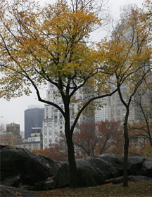
Central Park in the fall 2006
Welcome to Nautica X
Saturday, September 18th, 2008
A rainy day in new york’s central park reveals a hint of color through the mist. This template has been on the back burner for some time now, and we are very happy to be releasing it to the open source template community. We will be turning this into a blogger theme very soon, and if anyone is interested in converting this to a wordpress theme then please feel free to contact us.
You may use this template anyway you like, however we would appreciate it if you could leave the link back to us in the footer to help us continue to be able to produce more designs in the future. We have to thank slice n dice for all the amazing coding on this template. This template is Valid CSS and XHTML and has been tested to work in IE6-7, Firefox, Opera, and Safari for OSX.
Full page blog provides plenty of space
Saturday, November 18th, 2008
We wanted to create a blog template that had an understated feel to it and that would really provide enough space to really blog a ton of content. When we build our blogger theme we will be providing the full page blog template and the image and 2/3rds content format for you to pick from. Keep your eyes out in late Feb for the blogger and wordpress releases at STUDIO7DESIGNS.
We are moving more and more towards the 1000 pixel wide designs these days. In most cases for blogs and such, it is so important to have enough space to have white space around your text. This will help your readers breath and take in your paragraphs more easily. Here is an example of a float left image with a 2 pixel #CCCCCC border around it.

The padding on the paragraphs leaves enough room so that the text and image have enough space to breath. In this template we are experimenting with text as a design aspect. It is imparative to chose your fonts well, and to chose different types and sizes and colors to really use the font as a design paintbrush.
For this template we are keeping it simple enough as to let the focus be on the content, not the design. You can hop into the style sheet and increase the font color if you find these colors are too light. We hope you enjoy our designs and drop us a line as we always like to see our designs in action!
Thank you from STUDIO7DESIGNS, located in Beautiful Victoria BC Canada.
